Implementing Neumorphism with CSS
I set out to test Neumorphism by implementing it on my blog

Sandeep Ramgolam
There has been some buzz about this term in the techsphere lately and like every sane person would do on Christmas day, I decided to implement it on my blog to see what the fuss is all about.
Neumorph...wha?
It's basically a mix between New & Skeumophism. The latter was a design trend popularised by apple in which digital user interface elements would be made to look like physical ones.

Old iOS look
Of course, the "Flat" design trend that follow post "Windows 8" era was the exact opposite and killed the trend. Until recently.
So Skeumophism is back, but with a 2020 twist. It seems to have begun with this Dribble post by alexplyuto.

The dribbble shot by alexplyuto that might have restarted the trend
Implementation
Naturally I had to try it and what better place to test than my own website. I picked the "Events" page on this website, which has a flat design.

Events page, Flat UI
To apply the neumorphism look, you simply have to apply two shadows on the same element, one light shadow from the top left angle, and a second dark shadow from the bottom right angle. This will provide the smooth elevated look. To improve the detail you can also add a small light inset near the light shadow to make the edge smooth.
.neumorph {
  box-shadow: inset 1px 1px 1px #fff, -9px -9px 9px #e6e6e6,
    9px 9px 20px rgba(199, 199, 199, 0.8);
}
Demo
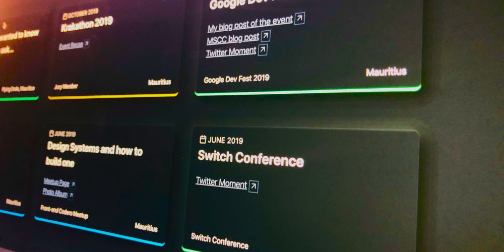
After applying the effect to the events page it now looks like the following :

Events page with neumorphism applied
Conclusion
I'm not 100% sold one the effect but it's definitely a step up from flat design. I'm gonna keep it for now.
How to implement in Tailwindcss ?
Tailwindcss already has a bunch of shadow utility classes that you may use such as shadow-md and so on. Tailwind allows us to extend itself using the config as such :
module.exports = {
  theme: {
    boxShadow: {
      default:
        '0 1px 3px 0 rgba(0, 0, 0, 0.1), 0 1px 2px 0 rgba(0, 0, 0, 0.06)',
      neumorphismdark:
        'inset 1px 1px 3px #1f2327,9px 9px 20px rgb(11, 11, 11, 0.8),-0px -0px 20px #1f2327',
      neumorphismlight:
        'inset 1px 1px 5px #fff, 9px 9px 20px rgba(222, 222, 222, 0.8),-0px -0px 20px #ffffff',
    }
  }
}
tailwind.config.js
<div class="event-card shadow-neumorphismlight dark:shadow-neumorphismdark ">
</div>
Event Card Markup
In the sample code above I used the tailwindcss-dark mode plugin to have a light and dark version.
Hope you enjoyed that!
Merry Xmas